If you want to attract and close high-ticket clients, you need a professional-looking freelance copywriter website.
There’s no two ways about this.
Sure, you can land freelance copywriting jobs without a website. And sure, some of those gigs can be pretty decent.
But, your client’s opinion of you and your business counts for a lot.
And if they believe you’re worth higher project fees, you’ll find it easier to charge them.
It’s as simple as that.
Thing is, a lot of freelance copywriters – despite being experts in creating copy for their clients – struggle when it comes to selling themselves.
So, in this piece I’m gonna run you through the key areas you need to cover on your freelance copywriter website to not only attract clients, but also convince them you are the best choice they could make.
We’re first gonna break down the core steps and elements of a high converting freelance copywriter home page.
Then we’re gonna break down a couple of the best copywriter websites to show you how others are applying these best practice principles.
The core pages of a great freelance copywriter website
We’re not looking to create a website that rivals something like HubSpot. At least, not yet.
We want something that gives you a home for your copywriting portfolio and that opens the door to potential clients finding yu passively through Google.
Right now what we want to do is set up a couple of pages on your freelance copywriter website that…
- Attract potential high-ticket clients
- Explain to them what it is you do for them
- Give an overview of who you are and why you should be trusted
- Outline your services and pricing
- Tell them what action it is they need to take next
To do all of the above effectively, you really only need 4 different pages.
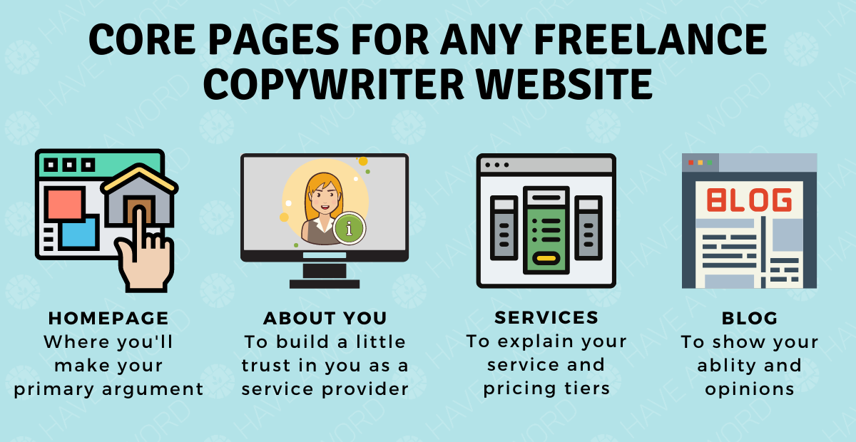
They are…
- A homepage
- An “about me” page
- A services page
- A blog
In this piece, we’re not gonna talk about how to set up a blog. I’ve covered that in other pieces (most notably this piece on setting up a freelance copywriting business).
What we’re focusing on here is how to get your copywriter website home page up and running as this is where you’re making your best argument for why to hire you.
Now, before we detail what’s needed within each section, there are a few ground rules we need to go over first.
The foundational rules for a freelancer website that converts
Below I’ve outlined a couple of basic copywriting principles that will help you create a website that works.
One page, one purpose
Everything you write should focus on achieving a singular goal.
If you’re trying to make 5 arguments in a single page, you’re going to ensure each one is weak and doesn’t compel action.
However, dedicate each page to a single goal and you’ve got a better chance of getting the reader to take the action you want them to.

This is a beginner’s lesson in copywriting here.
And it’s something every copywriter always talks about because it works.
You need that level of focus to get the job done.
Generally speaking, the goals you’ll be aiming for with each page are…
- Home page – To get people excited to reach out to you
- About page – To build trust in your abilities
- Services – To ensure people choose the right package when they reach out to you
Offer multiple CTAs on the page (as long as they have the same goal)
Don’t misunderstand this.
Your page should only have one goal. However, there should be multiple CTAs on that page to drive people towards that same goal.
For example, you might have 5 CTAs on one page. However, they all ask the reader to take one action. Perhaps to book a time to talk to you.
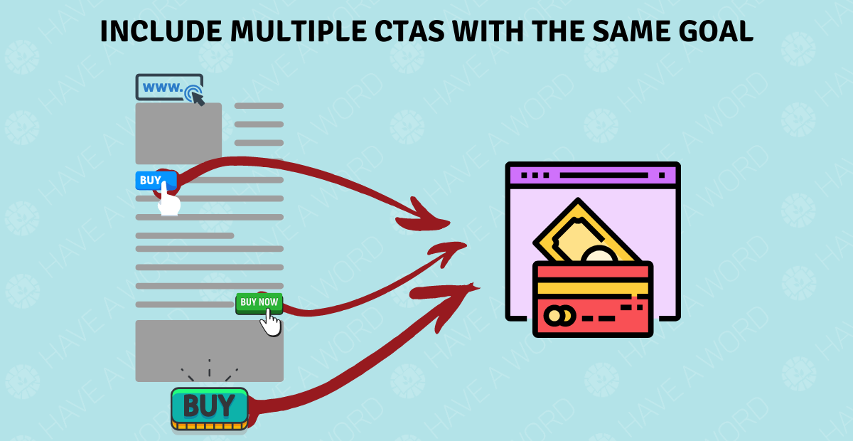
You need to place your CTAs at what I call the points of highest interest. Basically, when you think a person is most likely to take that action, you drop a CTA.
This is, honestly, a great thing for a copywriter to practice with. Sure, it’s great for your freelance copywriter website, but it’ll also help you provide your clients with better results.
Say it all as simply as possible
Jargon, complexity, and long-winded explanations aren’t helping anyone.
You need to say whatever it is you want to say in as simple language as possible.
For example, something like…
“Conversion focused, data-driven copywriter who actualises custom deliverables that continually advance software companies’ advertising CTRs”
Is absolute BS.
You need to make that simple.
The general guideline is the old 5-second rule.
If someone was to drop onto your site, would they know what it is you do within 5-seconds?
Often the answer is no.
Now, I’m not a huge fan of this overused formula, but it’s a good starting point for many who are confused.
If you don’t know how to simplify what it is you offer to your clients, simply go with…
“I help X achieve Y through X”.
It’s not the best copywriting you’ll ever see. But it gets the message across.
And really, isn’t that what your job as a professional communicator is? I mean, if people stop by a copywriter’s website and can’t figure out what they do, are they really gonna trust you with their money?
A real example for that might be…
“I help SaaS brands increase free-trial to paid conversions by refining their messaging.”
Offer one service to one segment
One of the main reasons freelance copywriters can’t simplify their message is because they offer too many services.
They’re offering blog posts, emails, sales page, case studies, and so much more.
Which makes it hard to really hone in on the value you provide.
Remember, a jack of all trades is a master of none.


Your freelance copywriter website needs to be focused on who you serve, and the service you offer to help them.
You’ll notice later on that all of the professional copywriter sites we analyse offer a single service to a single niche.
You need that specificity in your offer. If you don’t have it, you’re not gonna be able to get your clients the results they need.
Which means you won’t be able to charge those high-ticket fees you want and need.
If you’re not sure who it is you serve or how you help them, check out our article on choosing a highly-profitable freelance niche and copywriting service.
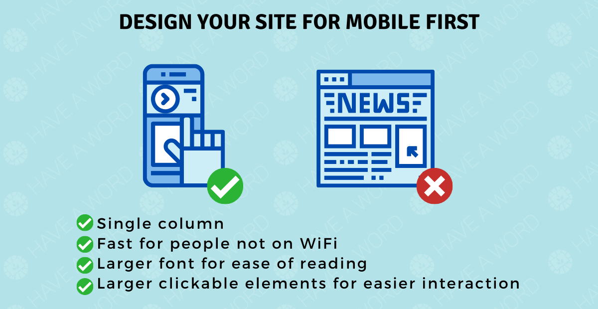
Create your copywriting website specifically for mobile devices
Google prioritises the mobile experience now.
And, with every passing year, more people use mobile to browse the web.
Choosing a mobile-first design is future-proofing your copywriting website.
Don’t worry too much about this.
In the tools and setup we recommend we’ve built this in.
In short, I’d recommend you…
- Keep your site design to a single column so you know the design works on a smaller screen
- Ensure text and “tappable” elements are big enough to be read and interacted with
- Minimise large images to increase loading times and ensure good UX is maintained
Beyond that, just keep your site’s code as light as possible (more on that later).
Use images strategically
You are a copywriter, right? And you’re setting up a copywriting website.
But, if you want to add that extra level of “pop” to your site you need to use images that help you communicate your messages to your potential clients.
The simpler you can make your website to understand the easier it’ll be for your potential clients to become clients.
And, whilst I am a man of the written word, I understand that a good image can do wonders for your website.
There is truth to the concept of a picture being worth 1000 words.
Where possible on your copywriter website, add an image that offers a quick explanation of the point you’re making.
These don’t need to be super complex and you shouldn’t worry if you’re not a designer.
A free Canva account can help you get these images off the ground and add that pop you need.
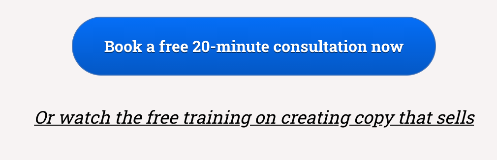
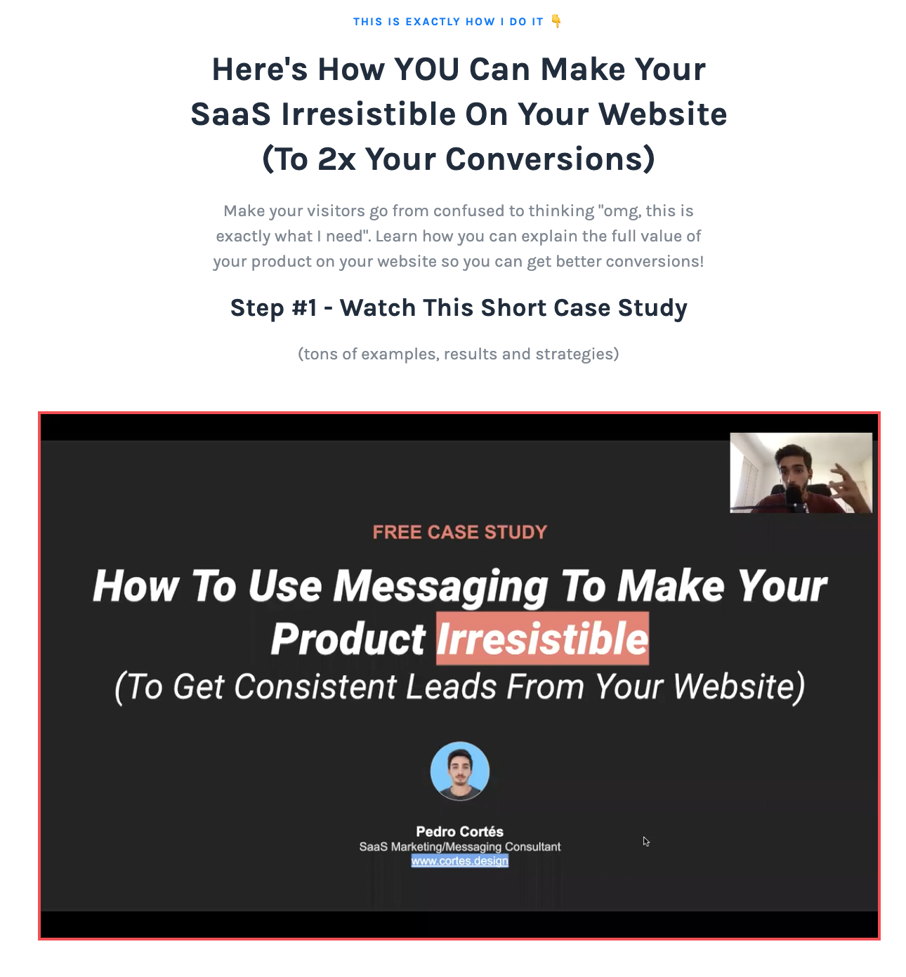
One of the best examples I can use here is from a chap called Pedro Cortés (there’s a full breakdown of his site later in this piece).
He explains that hiring him for expert guidance is a shortcut to revenue growth.
And To help him communicate this, he uses the below image.
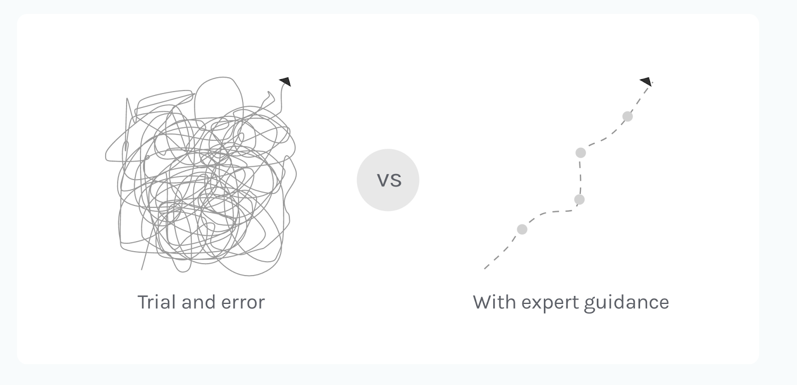
Simple, but highly effective.
This is what you should be aiming for. Simple images that help you get your point across. Don’t worry about the design aspect. A free Canva account will provide everything you need for this.
Remember, the goal of your site is to get freelance copywriting jobs
You’re paying for this website.
So, at the very least, you need to earn enough money from it every month to break even.
The good news is that’s super simple as setting up and running a simple copywriting site can cost as little as a few bucks a month.
If you can bring in one client per month from your freelance copywriter website, you’ll be making a profit off this.
But never forget the website’s sole purpose is…
…To make sales.
And the best way for you to do that is to focus on the return and the value your service provides.
This site might be owned by you, but it’s for your clients.
The whole site is there to highlight how you can help them achieve their goals.
Not the other way around.
Focus on your value and you’ll see yourself converting more visitors to leads, and leads to clients.
With that out of the way, let’s get onto the core components of your freelance copywriting website’s home page.
The basic formula for an effective copywriter website homepage
Everything I’m about to share is the MVA to getting your freelance website up and running.
That’s the Minimum Viable Approach.
We wanna get this up, running, and making sales ASAP.
If you want to get a hold of the templates I’ve created to make getting started as easy as possible, here’s what to do.
Sign up for a free Leadpages account and then opt-in for the templates from this exact article.
Within the download, you’ll find a link to download the custom templates I’ve created for LeadPages.
That’ll allow you to copy them to your account and get a great site up and running within minutes.
Now, onto the home page.
To ensure your page is as compelling as possible, we’re gonna focus on the below sections.
- Primary and secondary CTAs
- The Navbar – So people can click around your site to find out more information.
- The hero section – The bit that the person sees immediately upon loading your website.
- The “interesting stat” argument section – Something that reaffirms why people need your service.
- Proof – To prove you can do the job well
- Service tiers – Showing people what service you offer and how much it costs
- Final CTA – The last attempt to get people to take the action you want them to
- Footer T&Cs – A final link to your terms and condition pages
Let’s get into it.
Primary and secondary CTAs for your freelance copywriter website
Here’s the thing.
You want to push one specific action, right? And that’ll be done through your primary CTA.
On my own client-facing copywriting site, that primary action is to book a free 20-minute consultation.
So, at multiple points throughout the page I’ll drop the button that links to it.
However, you’ll notice that below that button there’s a secondary CTA, right?
This is there for those who aren’t yet ready to talk to me.
People who are gonna be wondering things like…
- Who is this guy?
- Can I trust this guy?
- Why should I hire him over freelance copywriter X?
- Does this guy really know what he’s talking about?
For those who aren’t ready, I drop a secondary CTA that helps answer those questions and bolsters trust in my abilities.
Here’s the thing though. I know this breaks the one page, one purpose rule.
So, what’s my excuse?
The page that it links people to is a middle step between where the reader is now and the primary CTA of booking a time to talk.
It’s less a distraction and more a detour.
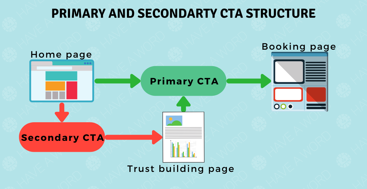
Its only purpose is to build trust to a point where they’re happy to hire me.
The CTA might not be exactly the same, but it eventually leads back to the primary CTA.
That’s why I’m comfortable breaking the rule here.
For now, I’d recommend you sign up for a free Calendly account and offer a free 15-20 minute consultation as your primary CTA.
The secondary CTA could perhaps point to one of your best pieces of content (that’s still on your site).
The Navbar section
The navigation bar is one of the simplest areas to create.
All you really need is a simple bar at the top of your page that lists the major areas of your site people might want to look at.
In this case, the navbar will include links to…
- Your services page
- Your about page
- Your blog page
And that’s it.
Don’t get cute or anything with your descriptions of these pages. Just explain exactly what clicking on that link will do.
Keep it simple.
The Hero Section
This is one of the most important sections of your website.
As David Ogilvy said, when you’ve written your headline you’ve spent 80 cents of your dollar.
The hero section is the headline of your copywriter website (or any website for that matter). It tells readers immediately what it is you do and why they should keep on reading.
However, you need a little more than the primary headline in the hero section.
I’d recommend your hero section include all of the below.
- Your primary headline (which should be a proclamation of the value you provide).
- A secondary sub-head
- A hero image (ideally of you)
- Your primary and secondary CTA
Remember, the primary goal here is to demonstrate the value your service provides.
The thing that I like to run with when writing a primary headline (or unique value proposition) for any website is to ask how, what and why.
More specifically…
- What is it you do?
- How is it going to help the client?
- Imply Why they should care
So, let’s take a case study writer for management consulting brands as an example.
The very rough outline of the value prop headline would be…
- What is it you do? I write case studies for management consultancies
- How is it going to help the client? – They improve customer trust in their processes
- Imply why they should care – More trust = easier sales and thus more revenue
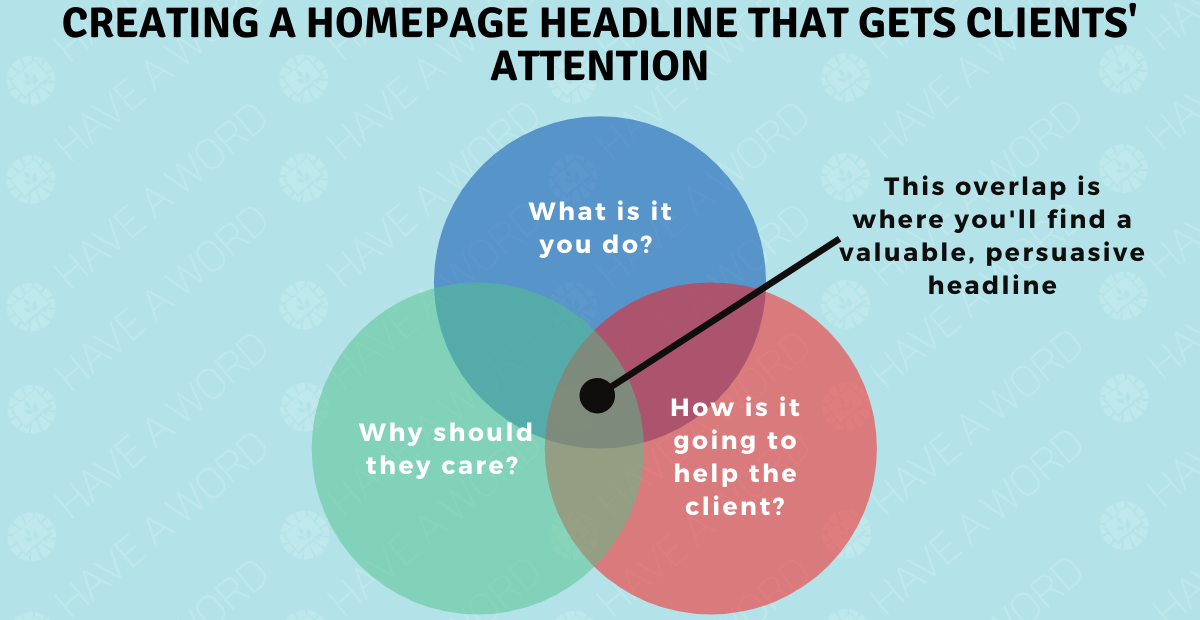
Your value prop should then hit on all of these items.
For example, if we use the generic explanation of the service, that could then be…
“I help management consultancies convert more leads into clients by creating trust-building case studies”.
It’s rough, but the potential client knows exactly what you do when they land on your page.
There’s clarity there which a lot of freelancers don’t have.
All we’re trying to do with the headline is grab attention by saying I can help people like you.
The sub-head underneath it will just go that extra step to describe why this is important.
In the above example, you might want to focus on how ti actually works. So something like…
“I’ll turn your best customers’ experiences into stories that attract more leads on auto-pilot”
The image should, if you’re the sole service provider, be of you.
And the CTA should be the simple primary, secondary option we mentioned above.
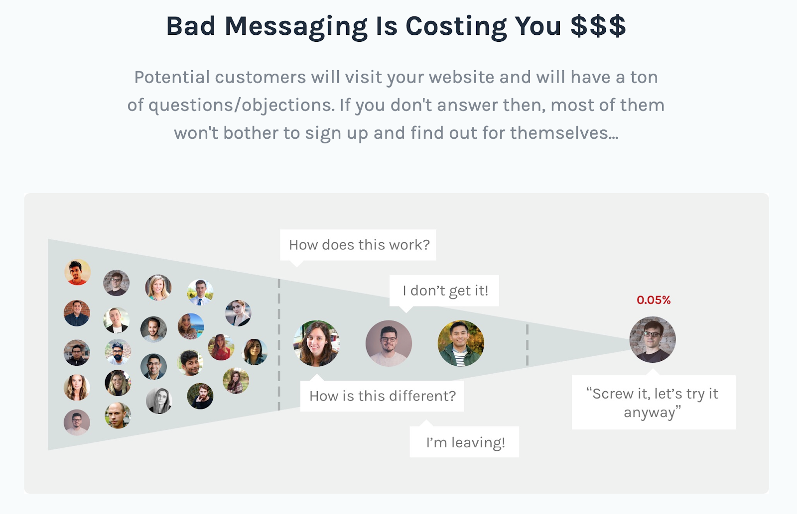
Your “interesting stat” section
This is where things can get super personalised.
Your interesting stat section could be as simple as a single paragraph. Or it could be a couple of sections all linked together.
The best “interesting stat” sections are those that play on the fears or struggles of the ideal client.
There’s no hard and fast rule here, but a few things I like to look for are things like…
- Obvious disparity between what can be achieved and what is being achieved
- A brief overview of your process (of it’s something most people get wrong/don’t understand)
- A mention of the potential opportunity
- Talk about how you simplify a complex or difficult process
You’ll want to explain the interesting stat and create 1-2 interesting, simple images in Canva to help you get your point across.
If we run with the above example of a management consultant case study writer, and take the obvious disparity angle, we could come up with something like the below (the stats are just made up for the example’s sake).
- Good case studies help management consultancies convert 24% more qualified leads
- On average, brands with a streamlined case study production process generate $128,000 more per year
- However, only 22% of management consultancies actively source, create, and leverage case studies
You’d obviously expand on these points in your page. And if you were to add a simple image to help highlight why this is needed, it might look something like the below.
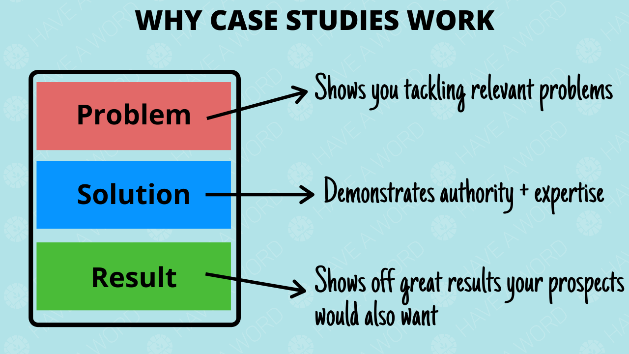
Providing proof of your copywriting abilities
Even the most well-written freelance copywriter website will struggle to convert high-ticket clients if you have no proof of your abilities.
Proof is a must-have when you’re asking people for huge amounts of cash.
However, whenever collecting proof you want to make sure that it’s specific and focused on the results.
Recommendations like “Dave’s a great guy and can write” aren’t persuading anyone.
But if you can get your clients to share the revenue gains, traffic increases, or CTR improvements you generated, it’s gonna help you stand out.
Remember, it’s all about the specific value you provide.
Make sure the value of hiring you is crystal clear.
There are, generally, 3 ways to show proof on your site which I’ll break down below.
1 – Use LinkedIn recommendations
This is one of my preferred methods.
After you’ve ended a contract with a client successfully, you can make a request for them to write a short testimonial on LinkedIn.
You simply need to go to the client’s account on LinkedIn, click on the “more tab” and the “Request a recommendation”.
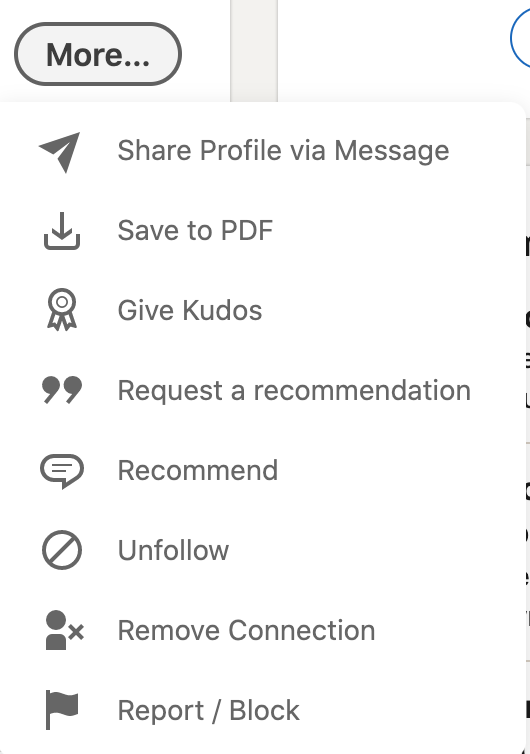
It’ll throw up a message box where you can request a recommendation.
Once they’ve filled it in, it’ll show up at the bottom of your LinkedIn profile.
As it’s on social media, you should be able to use that testimonial on your site for all to see.
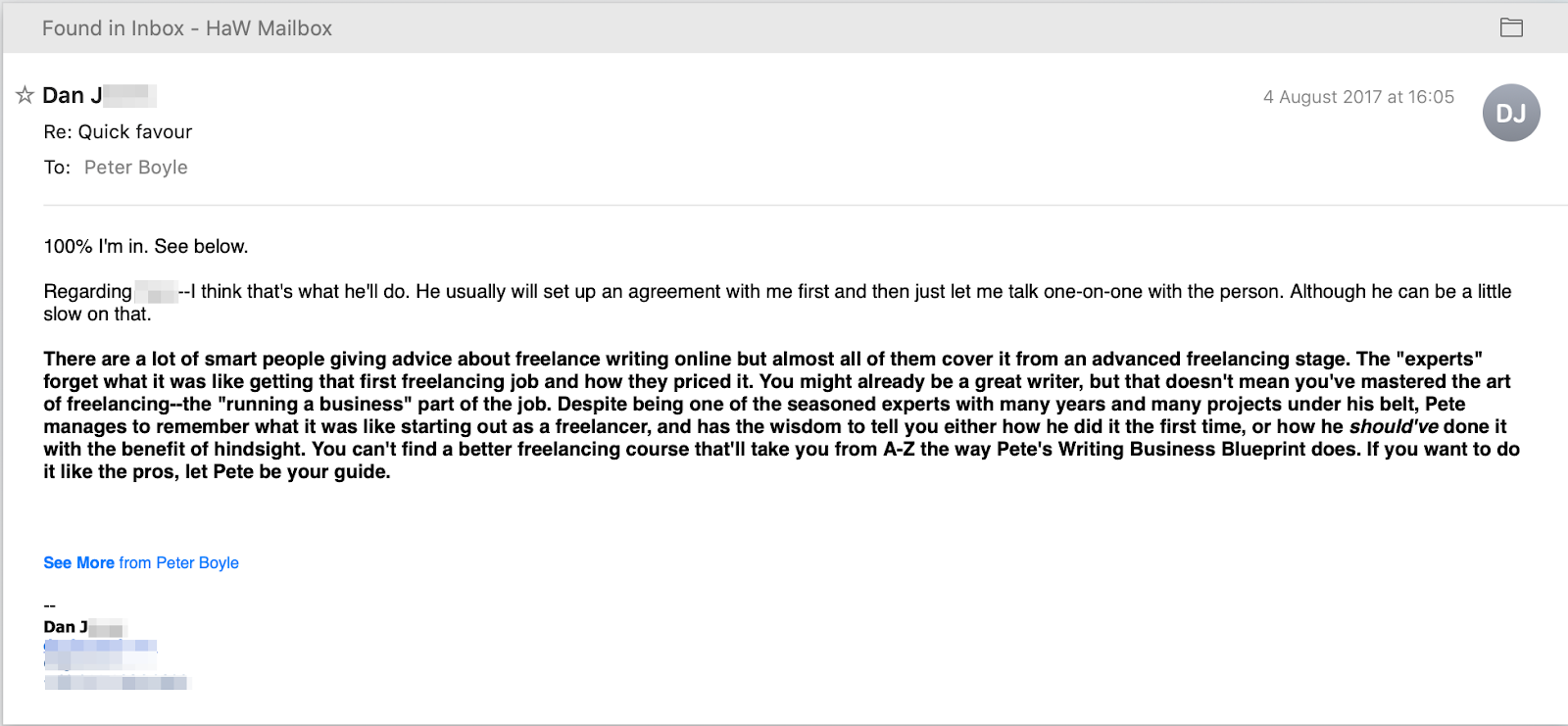
2 – Getting video testimonials
This is an increasingly popular option and with good reason. Video has super high engagement rates and there’s an extra level of believability when someone is sitting there telling you how awesome the service provider is.
You can do this in a few ways. Simply ask the client to record a breakdown of their experience with you like Manuel did for me below.
Or you can jump on a call with the client to talk through the process and how it’s affected their business. As I did with Dan in the below video.
Both are viable and both can increase the level of trust potential clients have in your copywriting abilities.
3 – Hidden proof
The proof here isn’t hidden because you are going to be sharing it with the world.
However, the proof is obtained behind closed doors, often through email.
Which is fine, but it can make it a little difficult to prove that the proof is real.
I dunno, maybe I’m just a stickler for being able to verify everything in this time of charlatans and liars…
Service tiers
When you’re pitching a service, I find the most profitable model is to offer 3 service tiers.
Basically, you give the client the choice of…
- A budget option that gives them the bare minimum they need to see results
- A “most popular” option that is the complete service and offers the best bang for their buck
- A “high-roller” option where you basically handle everything for them – this is great for you in terms of fee, but is a lot of work
You want to display these as a three-tier option on the page with some short explanation of what’s included in each tier.
There’s also some ninja-level psychology that goes into optimising the prices.
It’s pretty complex so I won’t go into it here. However, you can get a full explanation and guide to figuring out these service tiers and a profitable freelance rate in this article.

Final CTA
You’ve now done everything you can on your home page.
The last thing is to offer one final primary and secondary CTA to push people towards taking the next step to hiring you.
Nothing fancy needed here. A simple button and explanation of what they stand to gain is enough.
Footer Terms and Conditions
The very final aspect of the page should contain links to your terms and conditions.
We’re talking things like any disclaimers, your privacy policy, and other relevant notices.
This is to cover your arse from things like GDPR. You want a decent outline of your privacy policy and any disclaimers to ensure you don’t fall foul of the law.
Great freelance copywriter website examples
OK, so with the templates out of the way, let’s get down to looking at a few really good freelance copywriter websites.
These sites are from high-achievers in the freelance copywriting space.
I’ve offered a quick breakdown of what they do well so you can see that, even when applying the same principles, you can get vastly different and personal websites.
Pedro Cortés – Cortes.Design
This is, honestly, one of my favourite copywriter websites at the minute.
Even more so than my own.
I think Pedro has smashed it out of the park. And I know it’s working well for him because, in a recent interview with Harry Whelchel, he explained how he’s grown his business to make $32,700 every month.
Not bad hey.
But let’s break it down.
Niche and service

A huge green tick here for Pedro.
He offers one single service (messaging and positioning) to one defined audience (SaaS companies).
That’s gonna make it super simple for him to build a consistent message and process to attract more clients.
CTAs
Pedro also goes for the primary and secondary CTAs.
Primary CTA is to book a strategy session.
Secondary CTA is to watch a free training, which then leads back to the strategy session.
Simple, but highly effective as it all leads back to the consult.
Interesting stat section
Pedro runs with the angle that most businesses don’t have a messaging specialist (cause they don’t), and that if they want to really generate a tonne of money, they need a specialist.
What’s great is that he builds a good level of fear into the angle as he talks about the money lost through not having a specialist.
Proof
Short answer is, Pedro has a tonne of proof and it’s all absolutely incredible.
Really great proof too. It’s not about how nice he is or anything weak like that, it’s all tied back to the revenue increases he generated.
Which is what’s gonna get people to hire you.

Service tiers
Pedro has chosen to hide his pricing.
It’s not uncommon to do that, but you have to have a really well-optimised website (like Pedro does) to get away with it.
I’m sure Pedro has a great process to convert people to a high-ticket offer on his calls.
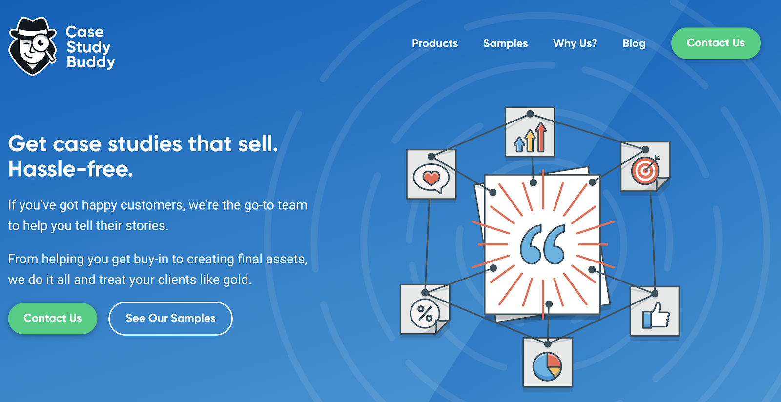
Joel Klettke – Case Study Buddy
Joel Klettke is a very well established conversion copywriter.
However, he’s also the founder of Case Study Buddy. A site that helps brands create case studies that make converting new business much easier.
While not a “freelance copywriter” website in the traditional sense. It’s a website set up by a freelance copywriter to sell copywriting services.
So it fits.
Let’s take a look.
Niche and service
CSB focuses, obviously, on one specific service.
Case studies. So we’ve got one out of two green ticks there.
However, there doesn’t seem to be a focus on any specific industry.
This is kinda indicative of a brand that’s doing well.
You see, at the start you want to grow your business with a single service helping a single market.
However, as you grow you’ll see how that service can grow to help parallel companies.
For example, someone who helps SaaS brands could perhaps grow the service out to…
- Other technology companies
- Other companies that rely on monthly payments
So while CSB doesn’t get the second green tick here, I’m sure it’s because they’ve grown past the need to focus on one market
CTAs
There are actually 3 different CTAs on this page.
You’ll find the main CTA is to contact them, presumably for a qualification chat and quote.
The secondary CTA is to check out samples. Which I like as it’s an obvious logical step leading towards the primary CTA.
However, there’s a 3rd CTA which leads to a page detailing their process.
On that page there’s a link back to contact them, but I’m not a huge fan of this.
I know a lot of copywriters out there like to include their process on the freelance website. However, I don’t think it adds anything.
I think a client doesn’t really care about the process until they’re closer to hiring you.
And even then, they only really care about which bits they have to get involved with.
I love how they all point back to the main CTA of contact us, but I would perhaps test cutting the third CTA.
(I’m sure they are testing and they might have data to suggest this addition actually adds $$$ to their bank).
Interesting stat section
They’ve gone with the whole “this is hard and we can make it simple” angle, which I love.
You’ll also see that they added in a couple of simplification images ot help explain what they’re trying to get across.
All in all, a great section.

Proof
Some great proof here. No videos, but a lot of written testimonials.
And they all focus on a key business metric CSB helped generate.

Service tiers
Once again you’ll find the old faithful 3-tiered service offerings here.
They’re not displayed on the home page, but they’re easily findable and they adhere to the general best practice guidelines for 3-tier pricing.
Val Geisler – Fix My Churn
Val is known as one of the premier email copywriters for subscription-based brands.
And to help her help more clients, she established Fix My Churn.
Like CSB, this isn’t exactly a freelance copywriter website. However, it’s a website set up by a freelancer to offer copywriting services with a better professional image.
It’s not focused on Val – the individual – but the concepts are the same.
And once again it’s a great example of how to create a great freelance copywriting website.
Niche and service

The hint here really is in the name of Fix My Churn.
If you’re not aware, churn is a term used by subscription-based brands. It means when a paying customer cancels their monthly payment.
So that’s one big tick for the niche. Subscription-based companies.
And if you read on, you’ll see that Val and her team do it all through email.
So there are two big ticks on the service and niche specification.
CTAs
Val has, once again, gone with a 2 CTA approach.
The primary CTA is a “talk to us” CTA. And it links to a page where you can book a call with the team.
The secondary CTA is to take a look at their process (there are actually multiple differently worded CTAs, but they all point to the same place).
On the process page, the primary CTA is once again listed.
It’s the same trend we’ve seen before.
The secondary CTA redirects to a page that removes the objection preventing the primary CTA click, before redirecting to that primary CTA.
A great process.
Proof
I’d say the social proof here is good, not great.
There’s some big names there talking about how great Val and her team are. However, I would like to see more specifics in those testimonials.
Something that tells me just how good the team is and the kind of revenue gains they’re helping people achieve.
Service tiers
There’s not a strong focus on service tiers here.
There is a mention of a 3-month engagement (without price quote) and a lower-tier audit for $4950.
Again, I’m sure Val has tested this as the two tiers that work.
It might not be the 3 tiers I always talk about, but it’s on the same lines.
One big tier and one affordable tier helps Val cover all her bases.
How to get your own professional freelance copywriter website today
I know it might seem intimidating when you’re looking at the websites experienced freelance copywriters have set up.
It’s easy to think that they have the money, connections, and time to build out something truly incredible.
However, creating a freelance copywriter website doesn’t have to be tough.
In fact, with the right templates you could have something that looks the part and converts your ideal customers in as little as an hour or two.
Which brings me to a little offer for you.
I’ve worked with another highly skilled copywriter to create a copywriting website homepage template for you.
If you already have a landing page service to host your design, simply sign up to the opt-in on this article and you’ll get a visual breakdown of the best copywriter website design.
If you don’t have a landing page service, still sign up.
In the confirmation email you’ll get from me you’ll find a deal to try Leadpages for free.
I’ll also send you pre-made templates for Leadpages, so you can simply fill in the blanks and get yourself a new professional website in no time at all.
0 Comments